
|

|
How does the style affect the word: Space |
HOW DOES THE STYLE AFFECT THE WORD: haribo"Haribo macht kinder froh und erwachsene ebenso!"
That is the jingle that is put on every Haribo package ever made. But does that Haribo make you froh when the logo has a different font?
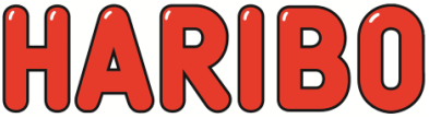
This is the original Haribo logo, a smooth, rounded logo with a red colour and black outline. Because of the white reflection effect, you get the feeling that the logo is 3d. The logo is so round and bubbly, that it almost looks as if it is a candy like the products they are trying to sell.
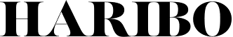
This one looks more strict and modern. It is a popular font under magazine designers, giving it a stylistic feel. Because of it's simplicity, the logo looks complex.
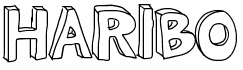
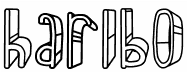
This joyful lettertype in my opinion could have been used for a candy company as well. It represents the sweet taste of candy and the hapiness of a child.
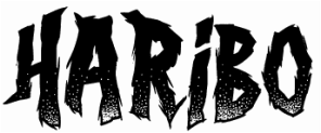
This one is alot harsher than any of the previous fonts.
|
